Logo Improvement – Case Study

Issues

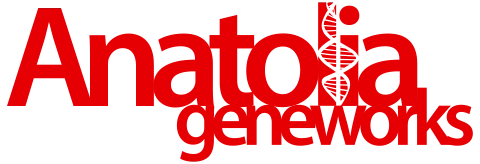
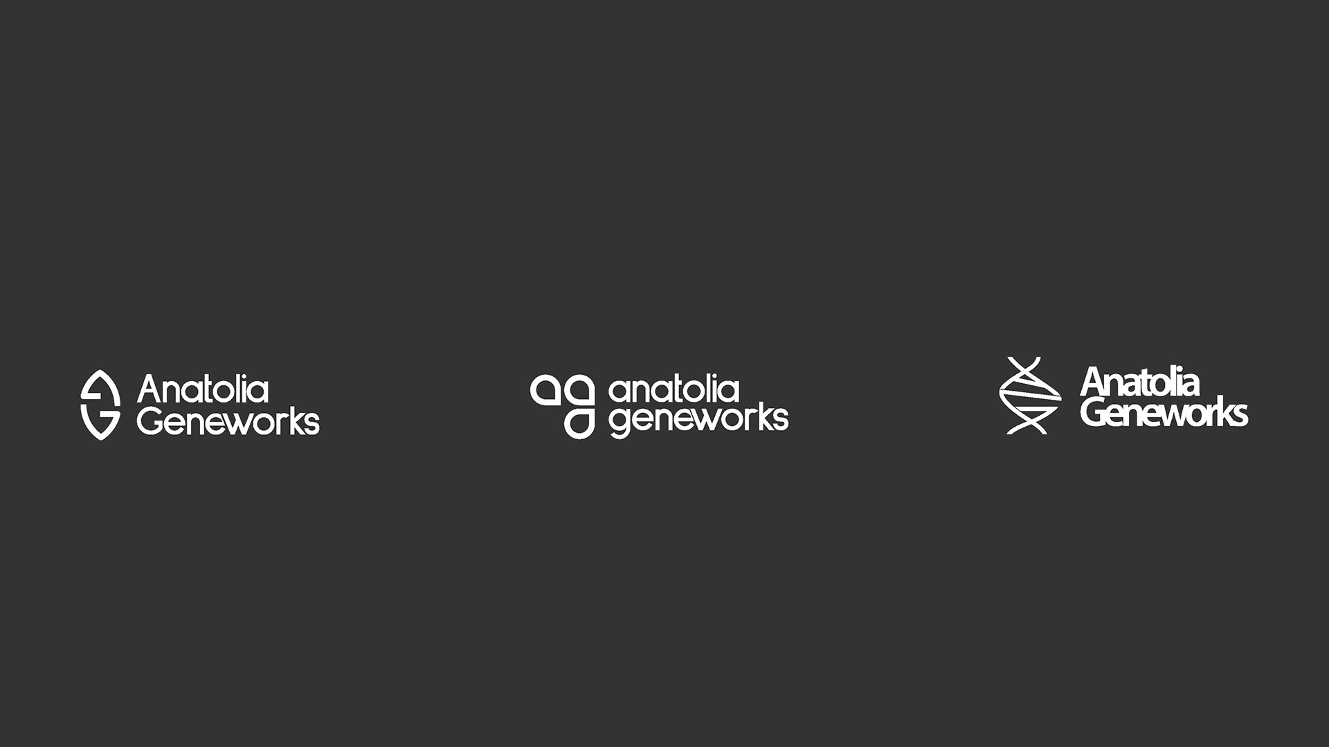
The existing logo lost readability at small sizes, and the DNA helix became invisible when scaled down. Since it wasn’t responsive, no icon version could be produced, making it inefficient in both digital and print. On applications such as trade show booths or packaging, the logo nearly fell apart.

Research & Sketches

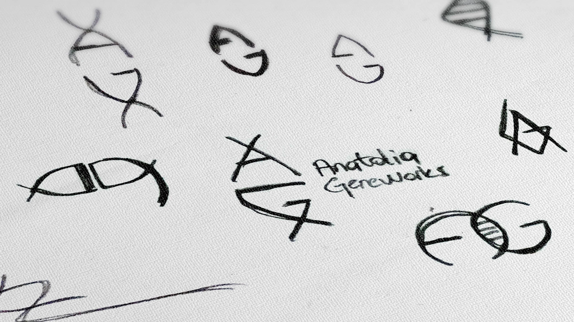
To solve these issues, I explored simplified and scalable forms. By combining the letters ‘A’ and ‘G’ with the DNA helix, I experimented with different conceptual sketches.

Concept Development

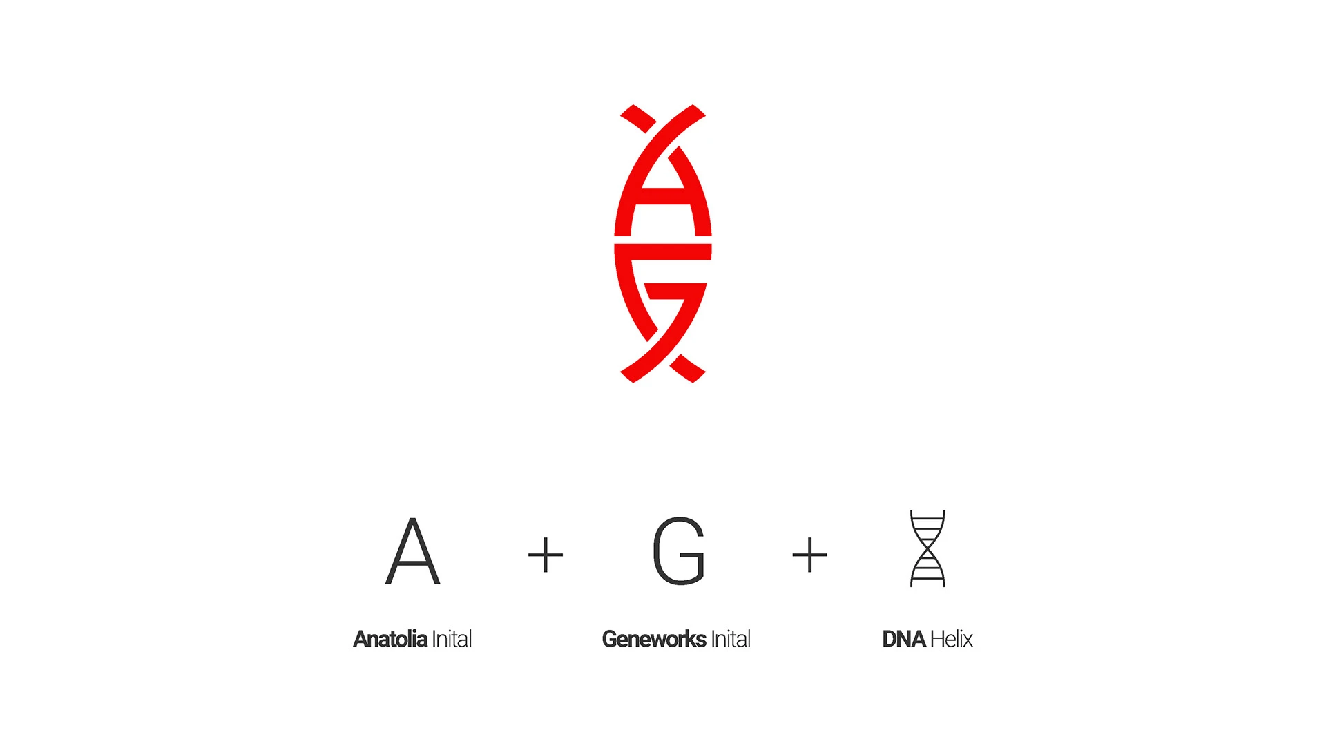
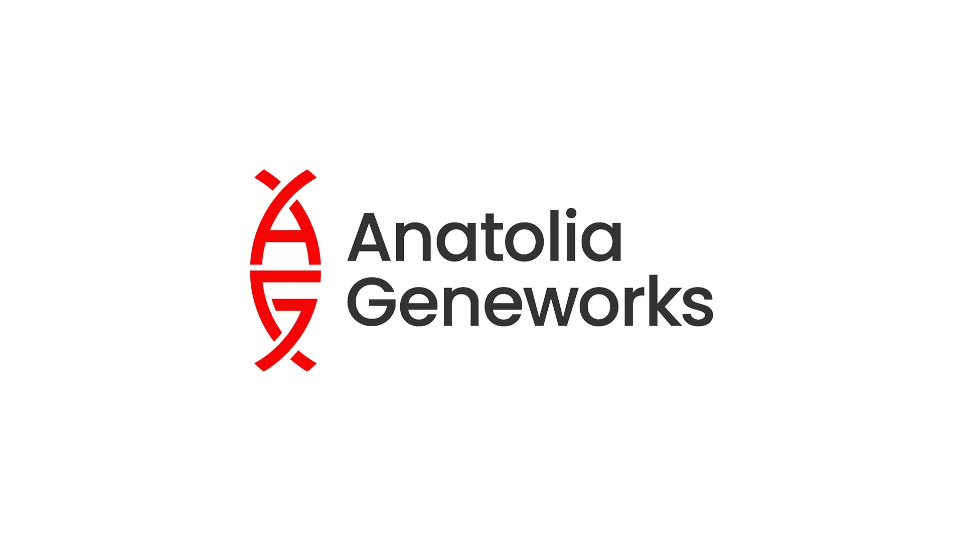
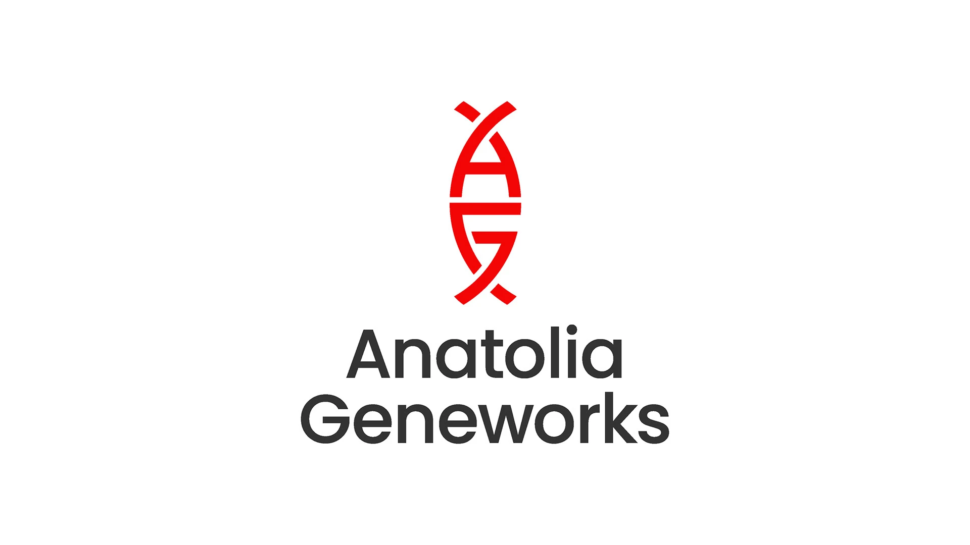
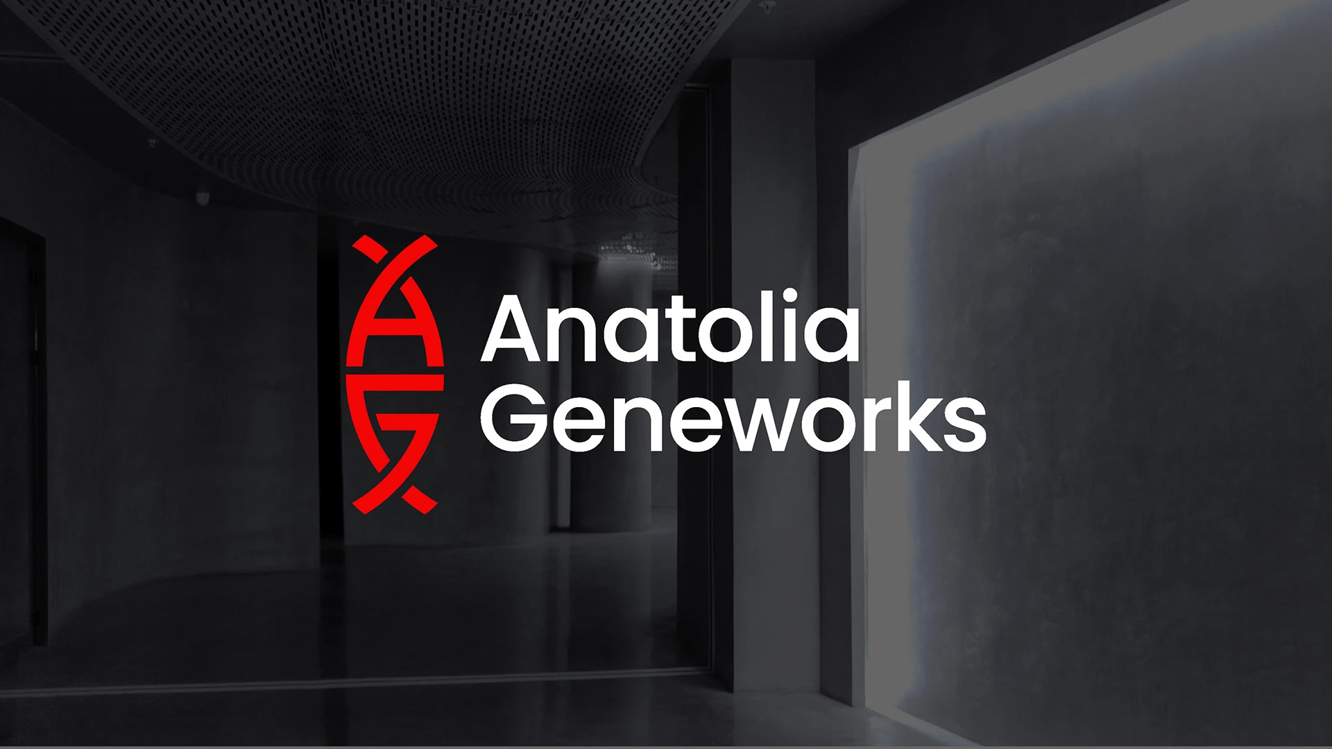
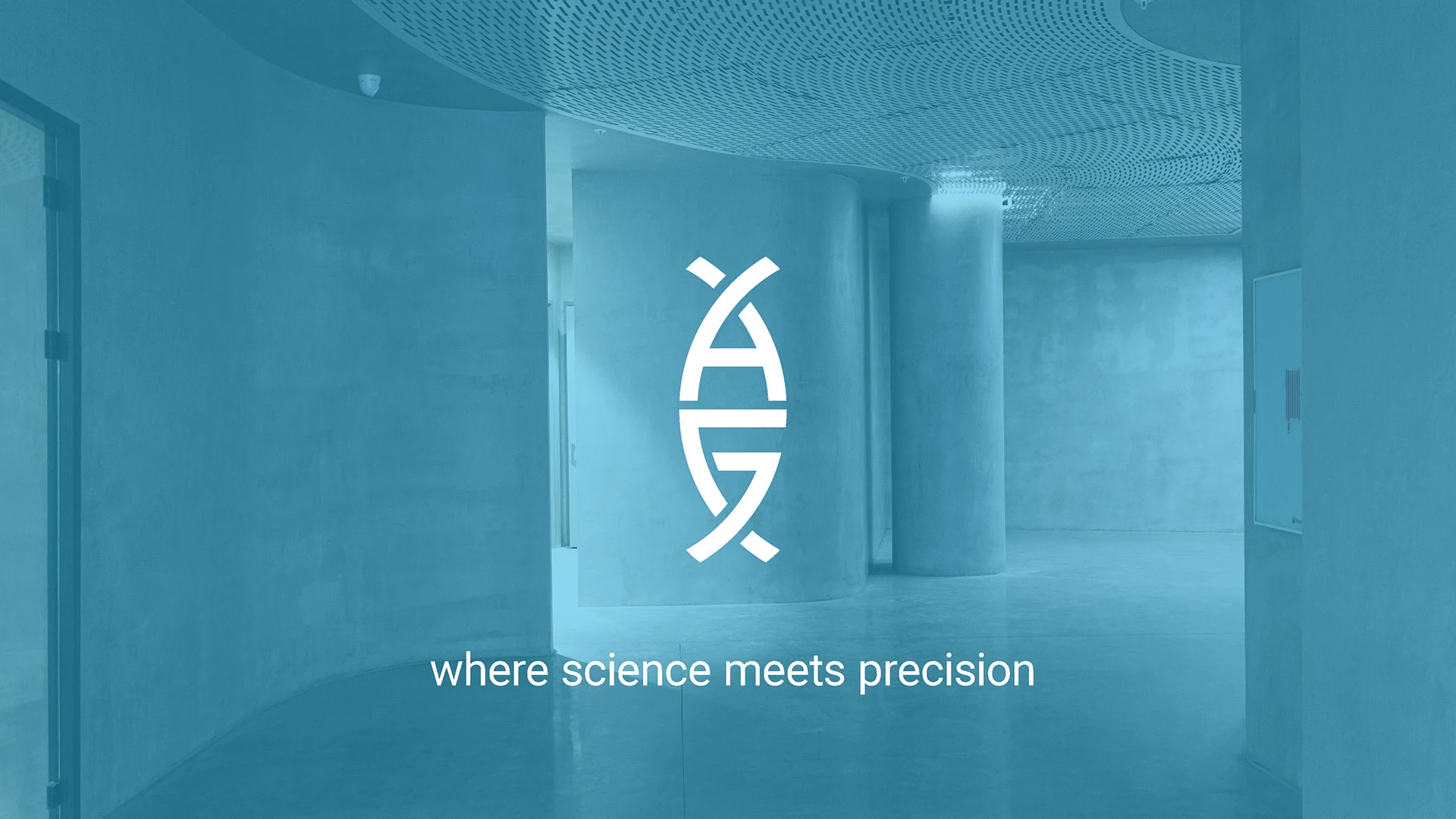
The idea emerged of integrating the letters ‘A’ and ‘G’ within the iconic form of DNA. The result was a distinctive symbol that represents the brand name while emphasizing its scientific identity.

Structure & Colors

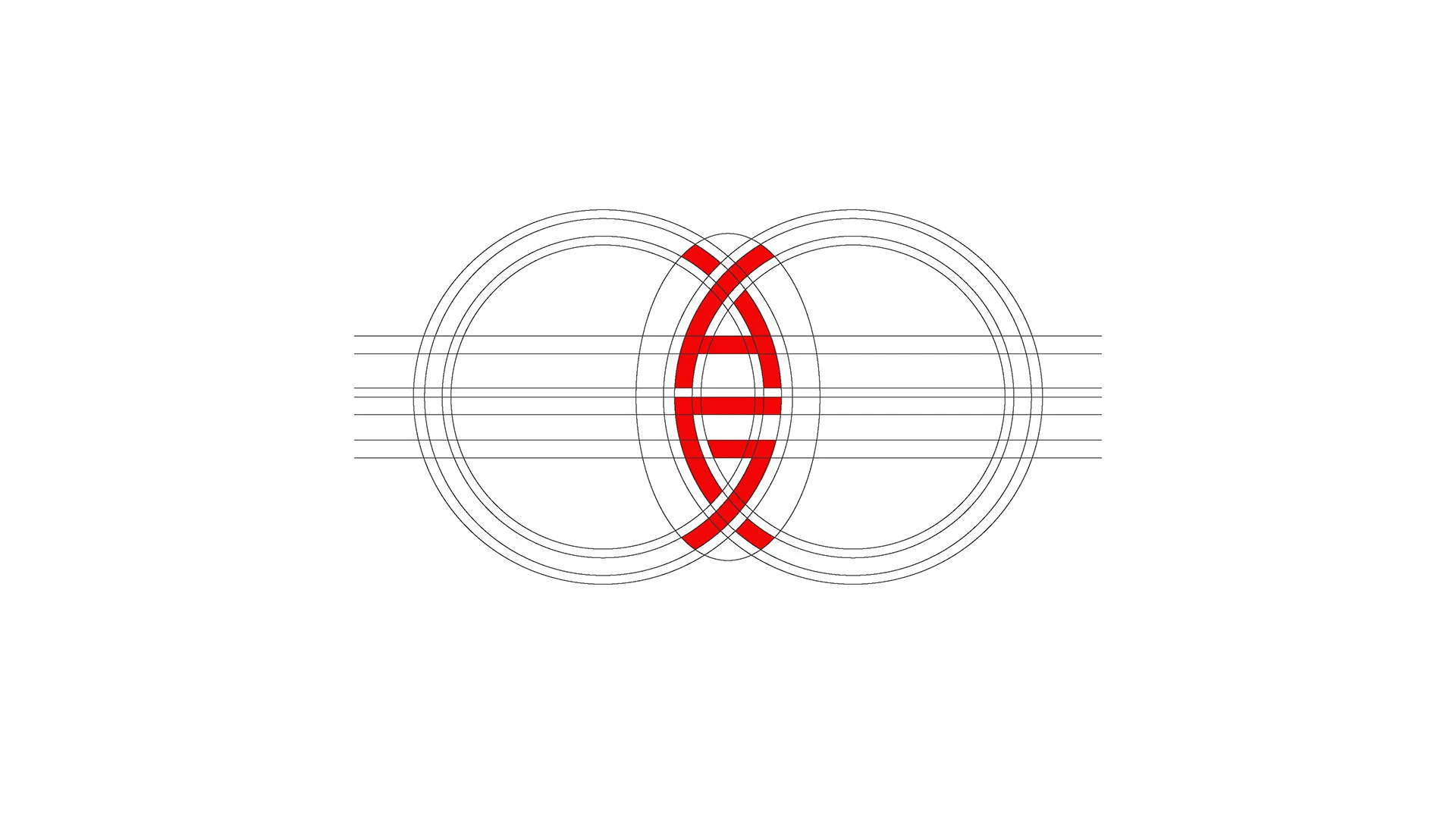
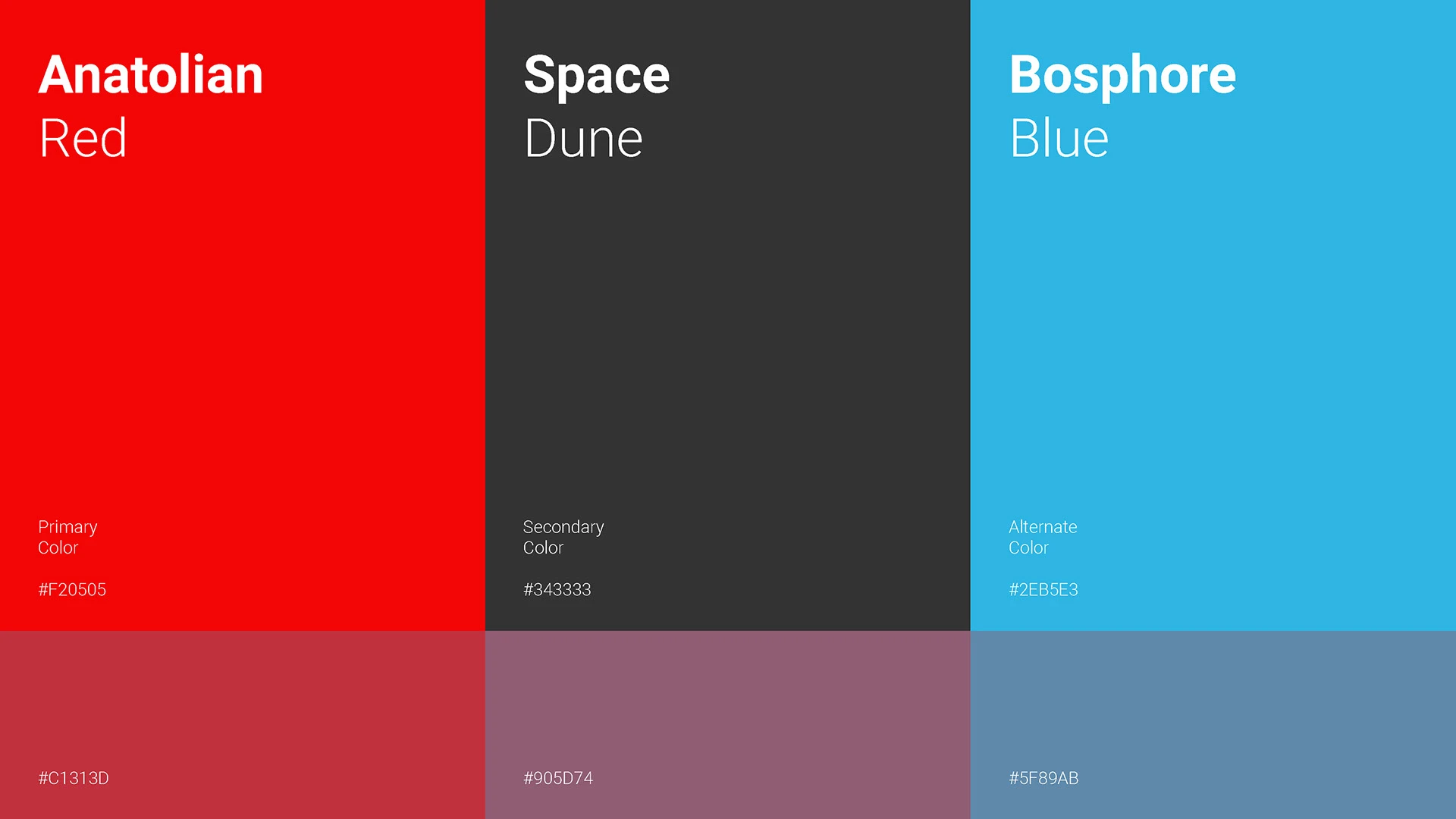
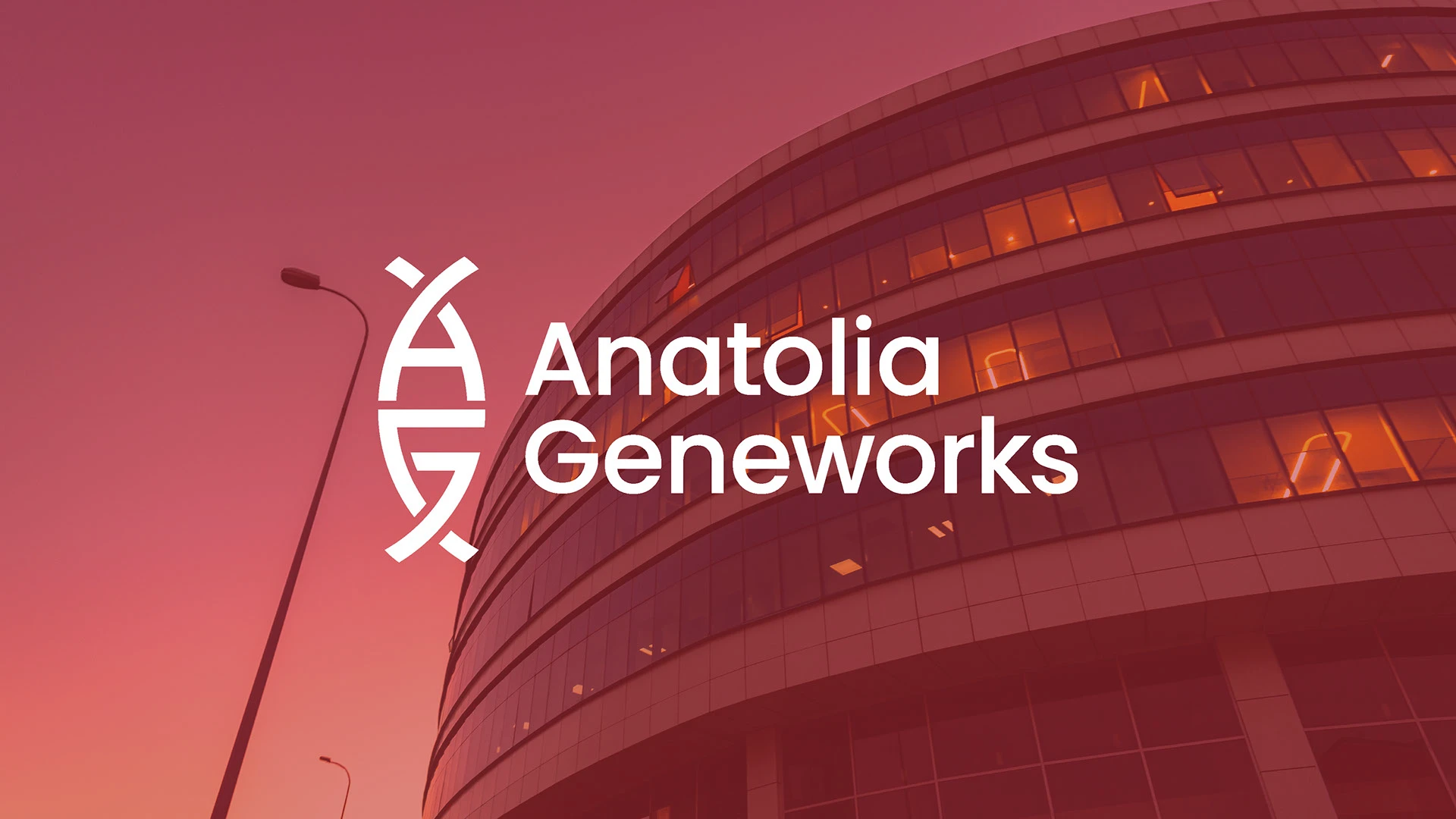
The logo was placed on a geometric grid to achieve balance and modern aesthetics. A unique palette — ‘Anatolian Red’ and ‘Bosphore Blue’ — was defined to strengthen the brand’s visual identity.

Outcome

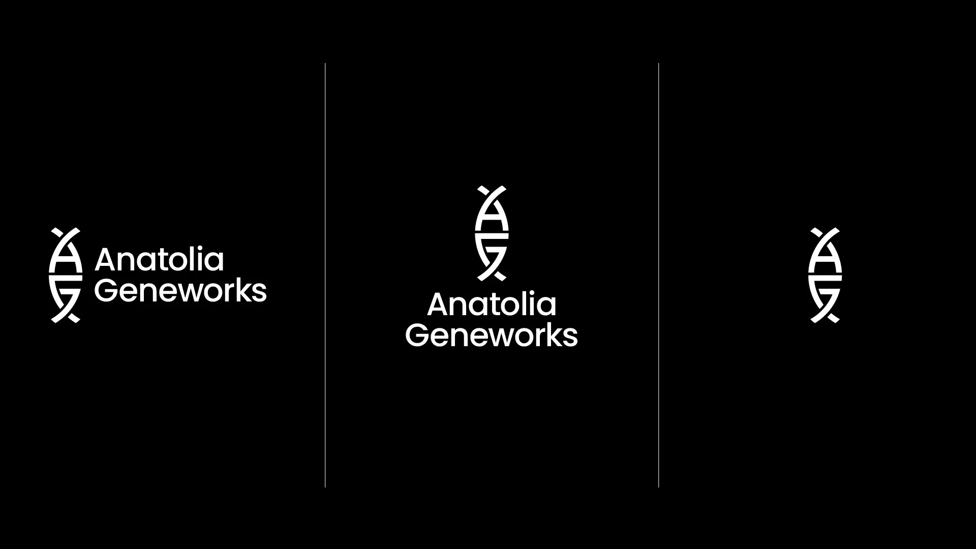
The redesigned logo provides a strong visual identity, solving both readability and flexibility challenges. Now the brand can be represented consistently across both digital and physical platforms.

Applications

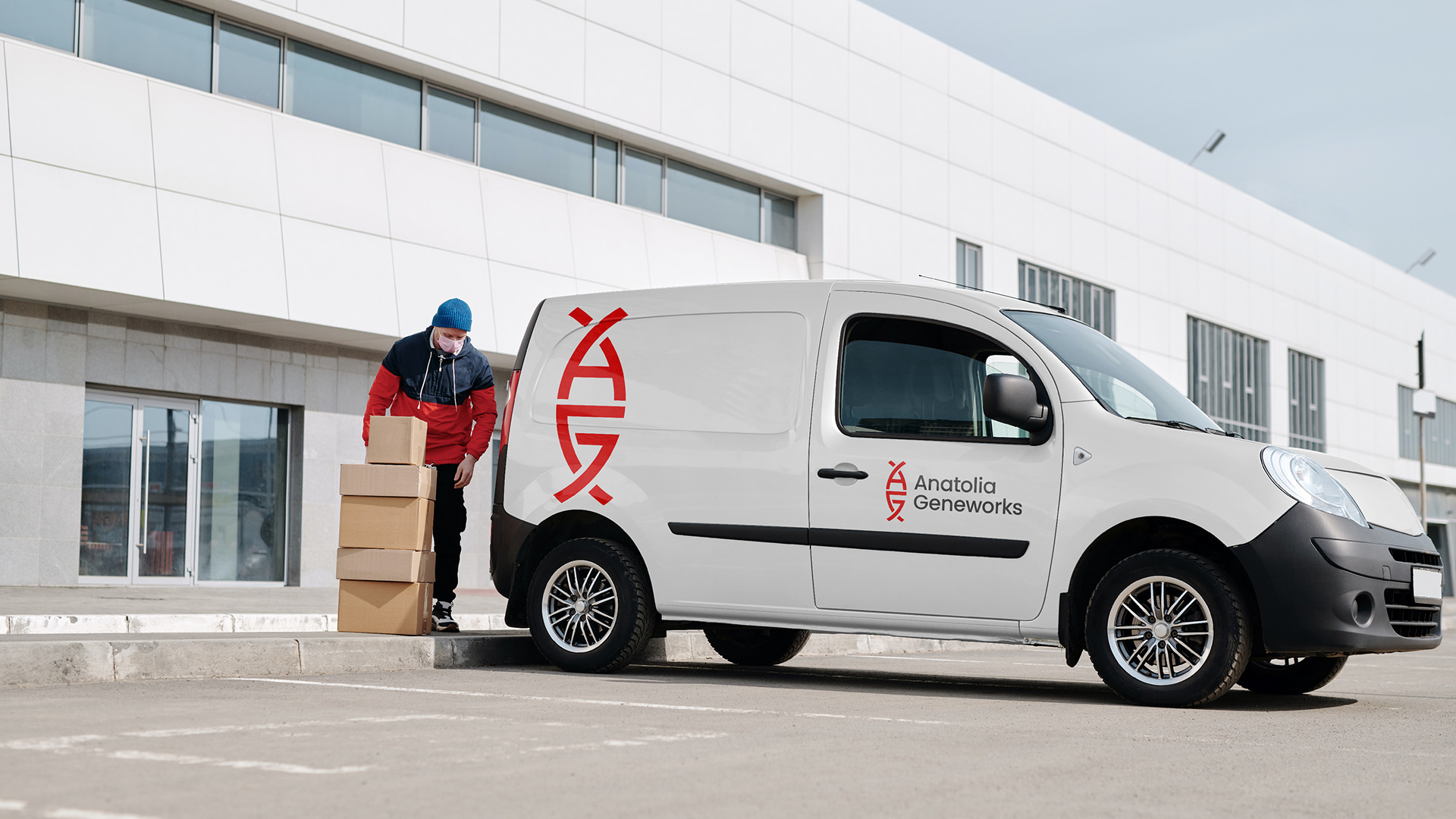
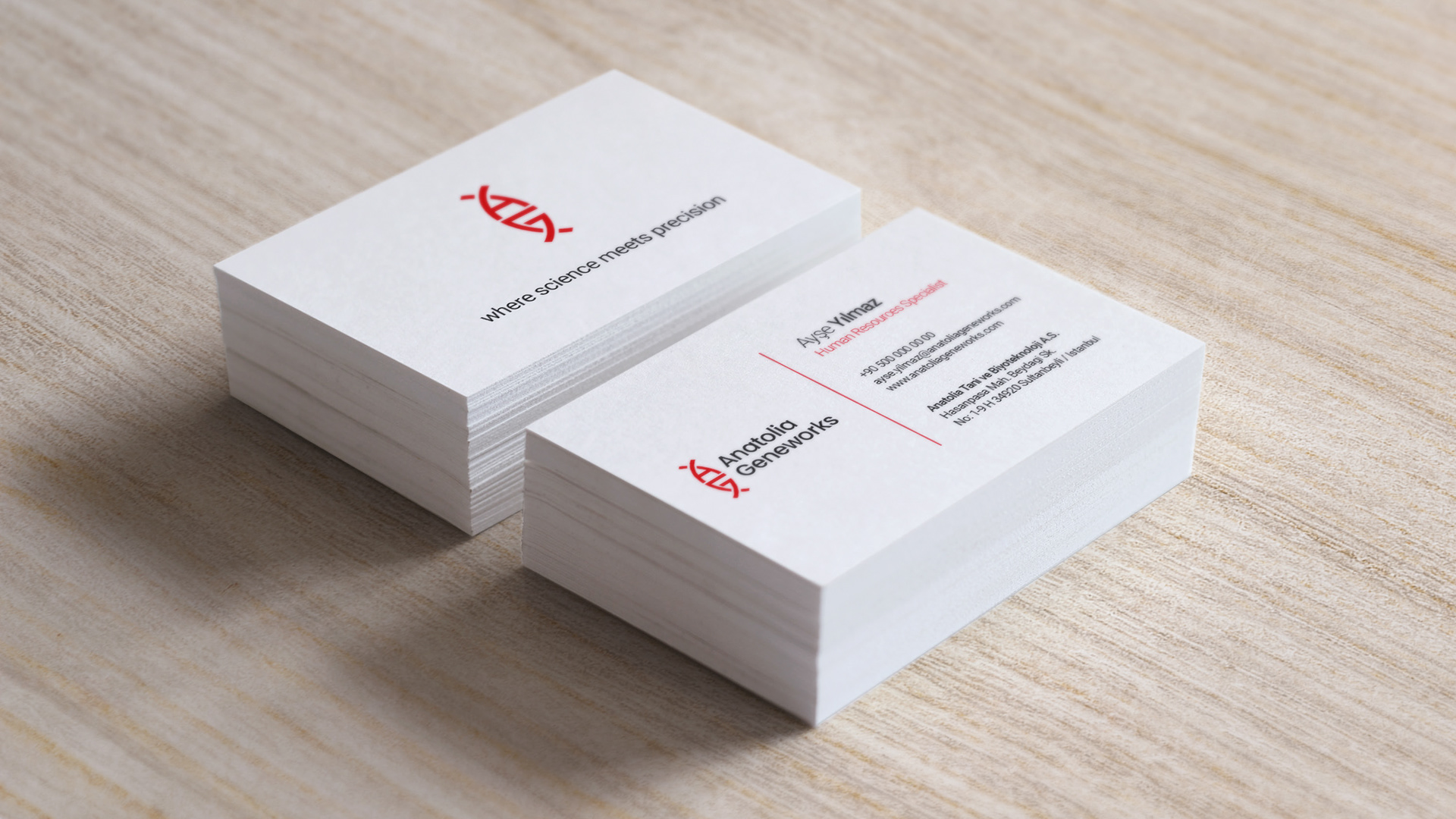
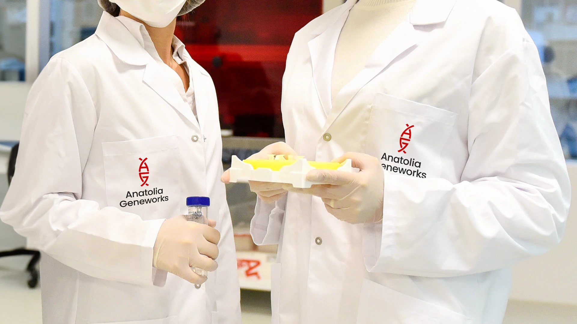
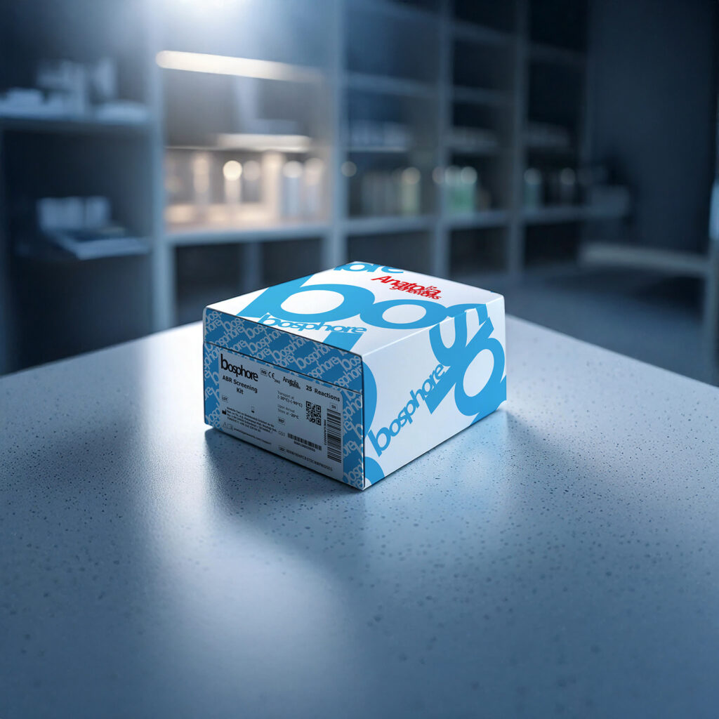
The new logo was designed to work seamlessly across a wide range of media — from business cards to vehicle wraps, digital screens to trade show booths. Responsive versions ensure brand consistency even when used as an icon or symbol alone.